They say “statistics lie,” but they don’t. People do.
Well, that’s a little harsh. Sure some people intentionally skew numbers and selectively pull data, but most folks misinterpret data by accident.
Why do you care if you’re not a scientist? Because you collect data about your business all the time — web traffic, revenue sources, expenses, customer behavior — and make decisions based on your (mis)understanding of that data.
Here’s a few basic mistakes I encounter constantly.
Statistics don’t tell the whole story
It’s easy to boil a data set down to a single number, like an average. Easy — and often shortsighted.
Single numbers feel powerful; you feel able to wrap your mind around a lot of data. Sometimes that is indeed useful, but it can also obscure the truth.
Consider Anscombe’s Quartet, four graphs that have identical statistical properties, yet clearly represent four distinct processes:
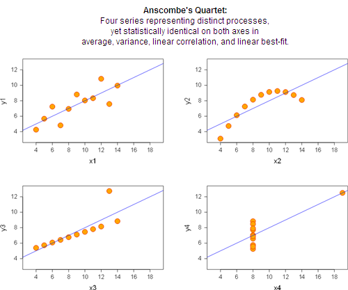
Since the statistics are identical in each case, it’s clear that statistics alone don’t describe what’s actually happening with the data.
The true story of each graph:
- The process is mostly linear. The best-fit line is handy in describing the relationship, but there are other possibly-random factors at work as well.
- The data are perfectly related, but not linear. Applying typical linear statistics is just wrong.
- The data are perfectly linear, with one outlier. Probably the outlier should be ignored, and the best-fit line should reflect the other points.
- The data don’t vary at all in the x direction, except for an outlier which probably should be ignored. All the standard statistical numbers are useless.
Lessons:
- Processes can’t be boiled down to a single number.
- Blindly applying statistics doesn’t explain what’s happening.
- Charts can help.
“Average” is often useless
You can’t open an analytics tool without being attacked by averages: Average hits/day, average conversion ratios, average transaction size, average time on site.
Trouble is, the average is often not only useless, but misleading. Take “average time-on-site,” a typical web analytics metric. It’s important enough in Google Analytics that it appears on the top-level site information dashboard, as shown in this real example from my blog:

Of course it’s better if a visitor spends longer on a site because it means they’re engaged.
Is 1:33 good? Actually that’s the wrong question. The true story becomes clear when you break this single number into pieces:
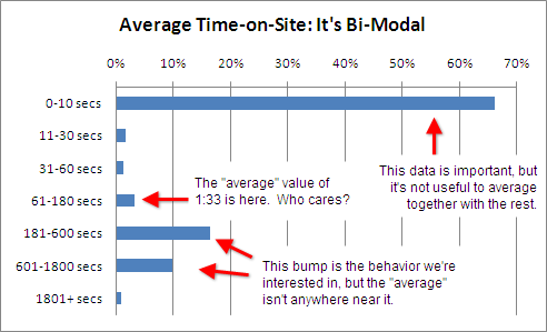
The “average” time-on-site of 93 seconds is useless when trying to explain user behavior. The correct way to think about time-on-site is:
- Most visitors “bounce” off the site without really looking at it.
- About a third of the visitors stayed long enough to read some articles.
Furthermore, the way you optimize #1 and #2 are completely different:
- Bouncing can indicate that the traffic source is poor (i.e. we attracted eyeballs, but they weren’t the right eyeballs) or the landing page was poor (i.e. we attracted the right eyeballs, but we failed to lure them into reading further).
- Getting a few minutes of time on a blog is already “success.” Trying to get someone to stay even longer (e.g. 10 minutes instead of 5) probably isn’t useful. So the better question is: How do we get more people into this category, rather than trying to “increase the average” in this category?
So not only is the average value 1:33 useless in describing reality, it’s useless in deciding what to do next.
Lessons:
- The simple “average” is often meaningless.
- Using a single number to describe a process obscures the truth.
- Using a single number to describe a process prevents you from learning how to improve and optimize.
The dangers of “Top 10” and “Others”
Whether it’s a cover article in Cosmo or a web analytics report, people love to read “Top 10” lists.
Top lists can be useful. For example, here are the origins of search engine traffic to my blog:
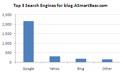
There are several “other” search engines (e.g. Ask and AOL), but the traffic doesn’t amount to a hill of beans (as we say in Texas). It’s useful to cut those out of the chart because they’re just noise.
The trouble starts when “Other” isn’t so trivial. The following chart is a real report from a board meeting I was in years ago (only the names and layout have been altered):
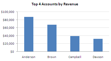
Looks fine. But later I was poking around the data myself and decided to add a category for “Others”:
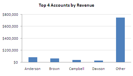
Some people call this the Long Tail — a pattern wherein a few big players are far larger than any other single player, but when you add up all the little players they collectively match or — as in this case — tower over the big players.
If you discover a Long Tail in your data, there’s several ways to react. Consider the case of having a Long Tail in sales of your product line, as with iTunes and Amazon who have a few blockbuster hits plus a long tail containing millions of products that sell infrequently. Here are four opposing viewpoints of how you could approach the situation:
- The Long Tail is too expensive to sell into because it requires reaching a lot of people, each of whom don’t give us much money, so it won’t be cost-effective.
- The Long Tail is the least expensive way to sell because it means reaching under-served markets, which means cheap ads and hungry customers.
- Addressing the Long Tail means we have to be all things to all people, and that means we’re unfocused. Instead, let’s try to be #1 at one thing.
- Trying to be #1 at anything is hard, and often the spoils go to those with the most money, not to the smartest or most passionate. Rather than fight the 800-pound gorilla, let’s address the rest of the market that gorillas ignore, but which contains a ton of potential business.
No one of these views is automatically correct. For example, iTunes gets most of their revenue from the big players (contrary to “common” knowledge), but other companies like Beatport make millions of dollars off the Long Tail of niche music markets (electronic music, in their case).
The only wrong thing is to ignore your “Others” column.
Lessons:
- “Top 10” lists can hide important data.
- Any time you truncate data you must first be certain you’re not throwing away important information.
- Data patterns like the “Long Tail” aren’t “good” or “bad” per se. There are usually many equally-viable ways for you to react.
Metrics and statistics “rules” cannot be applied blindly
Consider the following (intentionally unlabelled) chart:
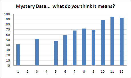
It’s tempting to start making observations:
- The average value is 57. (But you already know this is crap, right?)
- The value is generally increasing as we move to the right.
- Some data is missing. Maybe they should be discarded.
Unfortunately, even these basic observations are assumptions, and could be wrong depending on context. Consider these scenarios:
- These are a student’s test scores over time. The student was failing and not turning in assignments. However, in the middle of the period the student hired a tutor. Results improved, and by the end of the class the student had mastered the material.This student should probably be awarded an A or B because of the clear improvement and steady results at the end of the year when tests are hardest. The student should not receive a grade of 57 — the average.
- Each result represents a survey of one person on the effectiveness of a certain advertisement.The “zero” rating from subjects #2 and #4 is real data, and it’s a bad sign. This could indicate something drastically wrong with the ad, for example being offensive. We need to dig in with those participants and learn more about this failure.In general the average value — including the zeros — is probably a useful indication of the ad’s overall effectiveness. It’s curious that the results “improved” so much in later trials since the participants were supposed to be randomized. This may indicate a bias in the test itself.
An interesting result of #1 is that in order to obtain a useful “average” value we ought to throw away almost all our data points! The opposite is true with #2.
The point is that the context for the data determines how the data is interpreted. You can’t blindly apply a “rule,” such as which data points can be ignored.
Lessons:
- You have to interpret results in context, not blindly apply formulas.
- Form a theory first, then see whether the data supports or invalidates your theory.
Formulas are not a substitute for thinking.
Like any tool, statistics is useful when used properly and dangerous otherwise. Like any algorithm, garbage in yields garbage out.
Yes this means “metrics analysis” is harder than it looks. Yes this means you have to take time with your data and verify your thought process with others.
But what’s the alternative? Thinking about your processes incorrectly and then wasting time on senseless “solutions?”
Final lesson: Since metrics are hard and take time and effort to get correct, don’t attempt to measure and act on 100 variables. Pick just a few you really understand and can act on, and optimize with those alone. You’re more likely to make a genuine, positive change in your business.
What tips do you have? Leave a comment and join the conversation.
26 responses to “Avoiding common data-interpretation errors”
Nice post. I recommend the book “Flaw of Averages” by Sam Savage for more examples of where you can go wrong naively using averages.
.-= John’s latest blog post: Weekend miscellany =-.
Sam was a professor of mine at Stanford — a great book indeed!!
Great post. Figures are usually meaningless without proper context, and the length of time someone spends looking at a page may or may not have a correlation to how much they take in. As you said, it’s easy to look at without seeing, to view without taking in.
.-= John Clark’s latest blog post: Pick your battles… =-.
This is a very insightful post. I agree with John’s recommendation of /Flaw of Averages/. I’m sending this link to a number of analytic types I have worked with. Very good summary.
-JD
Hi Jason,
I really like your blog. I’ve been improving my data presentation and analytics skills lately. I’m currently reading the Visual Display of Quantitative Information, it’s super useful for design.
I’m looking for a good statistics/analytics book. Do you have any recommendations? Something more focused on the math than the design would be great.
Thanks!
Greg
Greg-
The one stats book that is a must for engineering types is: “Statistics for Experimenters” by Box, Hunter and Hunter. It’s a classic on how to design and analyze all sorts of experiments.
.-= Jarie Bolander’s latest blog post: If you register your site for free at =-.
Hi Jarie,
This book looks absolutely killer, thanks so much! I rss’d to your blog too.
Greg
This is really interesting. I really do not know enough about analytics, so I really enjoyed this. I think of breaking down data like anything else. I believe it’s always super important to do that.
.-= Alex’s latest blog post: Measures of Success =-.
You nailed it on only acting on a few variables. When you start to look at more and more stats, it starts to be a stats game instead of a tool for making a rational decision.
.-= Jarie Bolander’s latest blog post: Topic #21: Organizational Structures =-.
Averages are good if you had it categorized previously.
@flashopen
Another great post,
but let me just say that I there are several statistic tools that can show differences between the four data sets in the graphs.
The problem is blind, or bad statistics.
Yes of course there are appropriate statistics and analytics you’re right.
The fallacy is picking the common ones (e.g. “average” or “variance”) and running with them without thinking about whether they actually apply to the data in question.
Interesting. There is a lot more good stuff about (mis)measurement, manipulated stats, rigged experiments etc in the book “Bad science” by Ben Goldacre.
This selection of ClickTale blog posts is also much related. Even though not all will be interested in measuring engagement time with them it uncovers a true meaning of some wildly misinterpreted metrics.
I more and more convince myself that best way to do is to create own web analytics system. All you need is to tweak a bit your system to write some more info to Apache log files (user id, session id, and cookie), import Apache logs to database and write own reports. This will not require any JS added to pages as it will be written by Apache into your own log files. JavaScript is needed to virtually pass your web site log files to Google Analytics where you will observe THEIR reports reflecting THEIR interpretation of the data (average time on site is only one of them).
.-= Igor Kryltsov’s latest blog post: Questions to the reader =-.
As my father told me many years ago, “Figures don’t lie, but liars can figure.”
As you have shown here, even a moderately educated statistician can skew numbers to show any results desired. An unskilled person can inadvertently cause “the numbers” to show completely unrealistic results that would be accepted by many.
.-= James Smith João Pessoa, Brazil’s latest blog post: Free Computer Programs that work! =-.
Excellent post. Very informative.
Rather than “Statistics Lie”, my favorite quote is: “Statistics are like a string bikini. They can be very revealing while still hiding the most interesting details.”