Joy of Heatmaps
Have you seen those awesome heatmaps where eye-tracking equipment records exactly how people look at web pages? It teaches us where people look first, where they dwell, how they read, and generally how to optimize page layout.
Some examples:
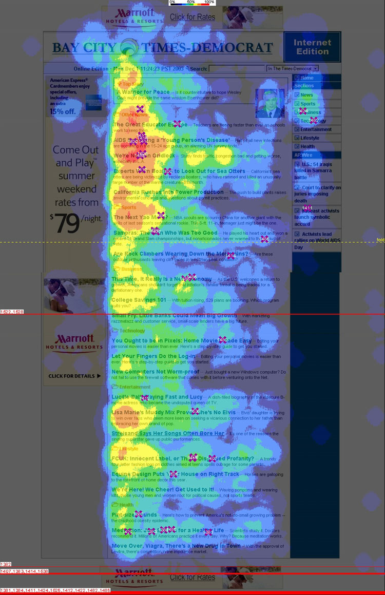 The Eyetrack III group shows that the top-left corner of your website is viewed first and most frequently, that people just read headlines, and that people read about five headlines per page regardless of how many headlines there are (so make 'em count!).
- An Eyetools study quantifies the value of being ranked 1, 2, 3, or more in a Google search and the relatively low value of appearing in a Google ad.
- Another Eyetrack III study shows how placement, styling, and size affects advertisement effectiveness of by a factor of 8.
Fun stuff! But of course you can't afford retinal scanners for your website.
Clicks aren't eyes, but it beats blindness
We can't track eyeballs, but there is something we can record: mouse clicks. Enter Crazyegg, an on-line service that records all mouse clicks on your website and produces pretty click-heatmaps.
Of course the question is: It is useful to know where someone clicks? If you had that information, how would you use it to change your website for the better?
Answer: Heck yes it's useful. Here's how it helped us.
Show, don't tell
The first revelation came from our book-ordering page. We have a yellow box near the top of the page with the obvious options: Order the book or view sample chapters. Here's what it looks like:

The click-heatmap of this section looks about like you'd expect; plenty of clicks on the clearly hyperlinked text:

Now it gets interesting. This yellow box is followed by a list of subjects covered in the book, then the book order form, then the table of contents with sample chapters. Hence the yellow box, allowing you to jump over the subject matter.
The subject matter list was not hyperlinked. Oops:

We should have just listed clickable sample chapters instead. (Which also would have satisfied the usual benefits vs. features rule.)
The click-heatmap made this error clear. Don't just talk about your product, show it!
Tweak the menu
The next insight came from our side-bar menu. Here's the heatmap:
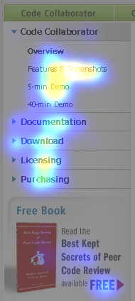
Our observations:
First, people are most interested in "Features & Screenshots," "5-minute Demo," and "Licensing." People are interested in seeing it work and finding the price. Probably these links should be repeated on other pages, especially the product's main page.
Second, no one wants to sit through a 40-minute demo. This valuable real estate could be promoting some other page — "Why review code" or "Whitepapers" or "Pricing" or "ROI" or anything else. We'll keep trying things until the click-test proves people are interested.
Third, people do see and interact with the sidebar menu. That sounds obvious but with previous website designs we had trouble with people not noticing the sidebar or not understanding that the main sections expand. Now we know the current design works.
Bigger click areas
An interesting feature of Crazyegg is that you can separately view clicks that were "successful" (i.e. hit a hyperlink) and "unsuccessful" (i.e. un-linked text, images, or whitespace). When we compared the two types of click we discovered that some areas of our website weren't nearly as clickable as they ought to be.
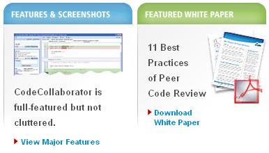
Take these info-boxes on the front page of our website:
The heatmaps of successful clicks show that readers want this information:
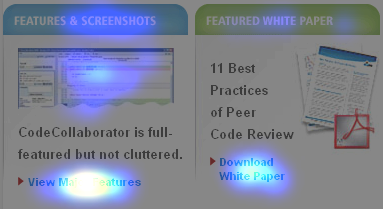
Now compare with unsuccessful clicks:
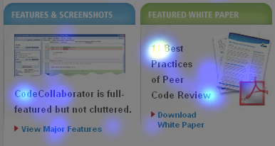
Our error is clear: People click everywhere in these boxes, not just the teeny hyperlinks at the bottom. They clicked on box titles, images, descriptive text, even blank space. This evidence shows the entire area is important.
In fact this was a general trend across the website: The larger the clickable area, the better.
Filter the noise
Then again, some highly-clicked areas should not be hyperlinked. Here's a normal, no-graphics, not-hyperlinked paragraph of prose from our Code Collaborator main product page:

It's full of clicks! This looks more like eye-tracking than click-tracking. When I first saw this I thought something was wrong with the Crazyegg software. Then I thought maybe "ensure reviews" ought to be a hyperlink since so many people clicked that phrase.
But once this image got around the office, about half of us said "Oh yeah, I click on words while I read too. Nervous habit. Or when I'm reading to someone."
So this turns out to be noise. Interesting noise, but not actionable.
The downside to Crazyegg
Not all of my experience with Crazyegg was positive. The gripes:
- Your website takes longer to fully load with Crazyegg. In my tests with a home broadband connection, it takes between a third to a half of a second to load their 20.5k Javascript code.This is mitigated around this by putting their Javascript snippet at the end of the page, right before the </BODY> tag. This way you incur the delay after the page had fully rendered where a user wouldn't notice it. [Thanks to Hiten from Crazyegg tech support who supplied the correction to this section.]
- The Crazyegg management interface is really slow. It can take minutes for a page to appear. On some occasions the pages never load. It took me about an hour to retrieve the screenshots for this article. This doesn't affect your live website.
- If your website has dynamic content, the heatmap is meaningless. This isn't a technical failing of Crazyegg so you can't count this against them. Still, it limits its applicability. Hopefully your more interesting pages aren't constantly in a state of flux. Perhaps you can freeze them for long enough to collect some data.
In the end, these problems are just a nuisance, not deal-breakers. The advantages in improving our website vastly outweigh these minor pains.
Conclusion
You really have no excuse not to try a click-heatmap technology on your website. It's inexpensive, it's easy to set up, and the information is invaluable. So get started!
Do you see something in these heatmaps that I missed? Do you have a favorite website analysis tool you'd like to share?
Leave a comment!
18 responses to “Heatmaps from Clicks: How Crazyegg improved our website overnight”
Hi,
Thanks for the comprehensive and awesome review of CrazyEgg. I wanted to address and clarify one of your gripes:
#1 about the slowness, "That may not sound like much, but they recommend you do this right after the <BODY> tag, so this delays the display of your entire page."
Actually we do recommend that you put our script at the bottom of your pages, right BEFORE the tag, so it does NOT slow down the loading of the site, in case the script is slow. This is exactly what you ended up doing :)
Here is a screenshot of our instruction page, I have identified the area where we mention placement of the script before the tag:
http://img.skitch.com/20081207-d1yqdkggdcfa57un47sw9k756w.png
As for #2 and #3, we are working on these things, especially #2, we have just recently experienced a high surge of usage and are working on dealing with the added users and traffic.
Please let us know if you have any further feedback or questions
Thanks again,
Hiten
Thanks Hiten! I’ve updated the post accordingly. I wish you continued success.
Thanks for letting me know about Crazyegg. As director of marketing in North America for a German company, I’m often frustrated with the way the German marketing department lays out the English-language website, but I’ve had no way to prove what I think is happening. This provides a fairly inexpensive tool for us to improve our layout.
Interesting tools but I am not seeing the advantage over using the free Google Analytics tool which also gives you a site overlay with clicks and you can also set goals and see how you measure against those which is great for ads.
@Barry: Google Analytics doesn’t do this at all. They say "clicks" but it’s not.
Specifically: Analytics shows you which pages people go to next. That’s not the same for two reasons: (1) If you have two ways to there there, e.g. a menubar link and a button on the page, you can’t tell which one was clicked. (2) You cannot see where people clicked but no link was there to click on.
#2 is just as important as #1, as I show above.
But, thanks for pointing out Google Analytics because of course that is a complementary and important tool for SEO as well, and one that many people don’t use well enough.
Huh. A realtively new and unique service.
What’s really surprising is the cost. Like, $10 or $20 a month for a regular website? Very nice – they’ve priced this so it’s affordable for anyone.
In fact, they should consider doing a volume program for those folks that have many clients and want to recommend this as part of their standard marketing stuff. ‘Cause there’s a good way to distinguish yourself – we provide a click heatmap!
@Wheel: Great point. You could email them at [email protected]. I found them to be responsive and intelligent.
you might also want to try out pagealizer’s scroll distance analysis
good one to go, i am saving it…
musicisall
Thanks for informing about Crazyegg
Very nice project. Thanks…
Great to see this image and I am sure that when you buy it, it will probably give you lots more insights into what people actually look at.
In reality, the website design and layout has a huge effect on this. Several new tracking softwares actually incorporates this data now. I’ve been using the advanced version of Affiliate Prophet and it generates "heatmaps" based in where your visitors stop and start scrolling and which parts of your webpage the visitor spends the most time. It’s still pretty crude, but I can imagine it will get a lot better soon. I love this more scientific approach to testing.
Deon.
This blog Is very informative , I am really pleased to post my comment on this blog . It helped me with ocean of knowledge so I really believe you will do much better in the future . Good job web master.
Excellent post! This information will certainly change one’s marketing strategy.
Informative professional site, whatmore can i say!!
Hi there Jason
I just started Crazy Egg and just read your interesting article. You are talking about comparing succesful and unsuccesful clicks, this would be very useful to me but i cant seem to find this option anywehere. Could you please tell me where to find this option?