If you have a blog, you want what everyone with a blog wants: More eyeballs. So how do you get them?
Well first you could remind readers to read your blog periodically. Everyone has email, so you add a conspicuous link that says "Email me when there's a new post."

Then there's RSS — the way tech-saavy folks are able to mark all as read carefully read every post from 50 sources. Okay, we have icons for that.

But subscriptions are just the beginning. Getting in front of new readers requires spreading the word about your posts. Of course "word-of-mouth" often means getting a post voted up on a link-sharing site like Reddit or Digg or StumbleUpon or Mixx or Sphinn.
Unfortunately there are a lot these sharing sites and you can't predict where you might get popular. Case in point — my article about QA vs. QC garnered thousands of views from high marks on Reddit, my article about website heatmaps stuck on the front page of Sphinn, and my article about how startups morph got over 100 votes on HackerNews.
So this leads to...
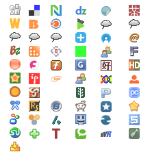
And of course there's Twitter and ratings and bookmarking sites and social networking sites and soon at the end of every post you have this:

(No, I didn't make up any of these screenshots.)
Okay, okay, enough of that. The question is: Is it a good idea to provide this much choice?
Is it better to include as many options as possible, satisfying the greatest number of people, or do people get lost in the choices, unwilling to put in the energy to find their favorite site?
There's plenty of evidence that people are happier and more motivated to act when they have choices. For instance, in one study done by Edward Deci, subjects were placed in a room with a variety of magazines and a computer. They were assigned the boring task of pressing the space bar on the computer when a color appeared on the screen; to keep their interest they were fed some nonsense about the task helping you sharpen concentration.
Half of the subjects were given instructions using words that connoted choice, e.g. "If you are willing, you can press the space bar to start over." The rest were instructed unequivocally, e.g. "Now start over. Press the space bar."
Mid-way through, the experimenter would leave the room after telling the subject that she couldn't leave for another five minutes but that she was free to continue with the computer or to stop and read magazines.
The people who felt like they had a choice in the matter actually continued the boring task longer than those who felt the task was forced upon them. With the perception that they were in control they elected to help the experimenter (by ostensibly giving them more data).
So this might lead us to believe that blog entries should be accompanied by a panoply of choices; if perceived choice leads a reader to be willing and helpful, great! And surely you wouldn't want to leave out the reader's favorite link-sharing site.
But is too much choice a bad thing? I know when I look at that array of icons I just want to hit the "back" button, not hunt around for the ones I recognize. But then, maybe I'm just a curmudgeon.
It turns out it's not just me. In another study, Sheena Iyengar and Mark Lepper sold jams in a supermarket. In one case, 24 jams were on display, in the other only 6. As you might expect, the display with 24 jams attracted more people — 60% of shoppers paused at the big display versus only 40% for the small. But would they purchase?
Only 3% of shoppers who stopped at the big display actually bought a jam, but an astounding 30% of shoppers at the small display made a purchase. Even with fewer choices and fewer people stopping by, the display with six jams was nearly seven times as successful at getting customers to act.
This result has now been repeated in different forms, and always the result is that a little choice makes us happy, but many choices overwhelm us into inaction.
So back to the blog. Give the reader a few choices, but resist the urge to list every site on the Internet. It might mean a certain reader's favorite sharing site isn't listed, but dumping icons on the screen stops everyone from acting.
What are your thoughts on how many choices is too much? Is there a time when having 100 choices is actually a good thing? Which link-sharing sites do you actually use? Leave a comment!
P.S. If you like this post, you have a choice of subscribing by email or by RSS feed and to post it on Reddit and Digg and Sphinn and email it to a friend and post it on Facebook and Twitter it. But don't feel like you have to... ;-)
9 responses to “Get more blog links by offering fewer choices”
Hi
Too many icons and I’m probably shutting the browser, let alone hitting the back button ;)
Too much of a visual shock and trying to look for the one you want is a pain.
Interesting stats.
I only use stumble, but then, I’m fairly new to all of this…
Juliet
I would’ve read this post, but it had too many icons on it.
Another study somewhere said too much choice was bad… I think it was for 401(k) plans. People who had a lot of choice on where to invest did worse than people who had a few choices.
I’m with you… I think the 80 for 20 principle is the best thing to apply.
Ha! I guess I get the jokes I deserve for saying "don’t have icons."
It’s interesting to hear your points of view; thanks for sharing!
I agree that too much information over load is a visual shock and a turn off. More is not always better.
There is a great book that goes into even more detail about this choice vs. action (and also quotes the jam experiment above): The Paradox of Choice.
Not only does an overwhelming number of choices lead to innaction, but in same cases, even depression. This is, in my opinion, a must read for all marketers, particularly those in the CPG sector (do you REALLY need that next line extension?).
It is very much confuse to understand due to many icons i may suggest that some icons must be decrease so that will be helpful for other.
=============================================
Rock
Business Opportunities
I have collect more information from this site . This site is very important for me. I will keep it up. We have a boiler installation company in UK. If anybody wants any help for boiler installation please visit our site.
http://www.boilerinstallationslondon.co.uk/
I agree, i think too many icons would not be soo interesting at all. The more you try harder for your blog to be more interesting and look good, sometimes will just end up a disaster, maybe its good to place icons that are only needed. Nice post and information! Also, try to Check this link, you might want to add this blog or yours to that link, so everyone can see this article you have. http://www.freepressreleasecenter.com
Marcus
Online learning
I think the concept of giving in few choices works even for sites that are intended for Ads .. of course they still need to give value to the readers.