We recently underwent a Cinderella-like transformation: A total redesign of the WP Engine website from despicable steaming pile of hideousness to a designed, thematic — dare I say artistic? — sleek new look.
Does it matter?
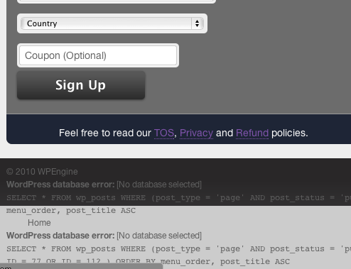
It must have mattered. Look how bad it was. Not only were the pages just ugly, they were peppered with database errors and CSS blowups:
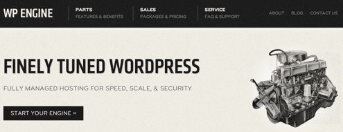
Just look at us now, sporting a grayscale 1950’s automotive motif playing off the “engine” concept using the latest in CSS3/HTML5 trickery:
It was such a contrast, customers emailed us saying “Thank God you fixed that horrible website. I was embarrassed when referring you guys to friends.”
But hold on. They were still customers. And they still were referring us to friends. So I wonder, did it really matter?
Modern Lean Startup theory blares out from the red-tiled rooftops of Stanford: Seek the Data and Ye Shall Find!
First the bounce-rate. If our website design was repulsive — literally — the bounce rate should now diminish. Here’s the data:
Can you see at what point in time we changed design? No? Must not have made a difference.
Let’s look at time-on-site:
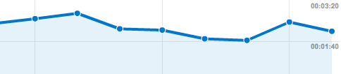
Nothing.
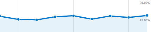
But this is all superficial — what Really Matters is the Conversion Rate: are more or fewer people signing up each week:
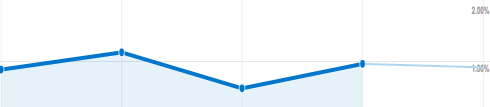
Hmm. Looks like everything objective is saying “it doesn’t matter.”
But as much as I respect and follow Lean Startup theory, objective measurements aren’t the only things that matter. Those customer emails matter too.
Maybe the most interesting change was in our own team. I heard things like “I’m soooo glad we fixed the site. I was really embarrassed by it.” That matters.
The other day we landed a large customer who said they could tell from our website that among our competitors we’re more mature and ready to handle a bigger customer like them. I can tell you — objectively — that we’re among the youngest of our competitors, and although I have a list of reasons why “we’re better,” the truth is that particular customer would probably be served just fine by several of those competitors. Was it the design that gave us that edge? Could be. Didn’t hurt, anyway.
Still, the more I look at the importance of design in the startups in my little career, the less it seems to matter. I’ve chronicled the eye-melting design work that punished potential customers in the evolution of the Smart Bear website, and yet with all that cringe-worthyness, here is a company that doubled in revenue and profit like clockwork for half a decade — a stat any startup would be proud to match. It doesn’t prove design doesn’t matter, but it does suggest design may not be the deciding factor.
An even more extreme example comes from my second company ITWatchDogs. I displayed its old homepage at the magnificent Webstock design conference in Wellington earlier this year; the crowd whooped at our violent assault on the visual arts, complete with calliope menubar colors, two broken images tag above the fold, and a layout model that could be seen as a “grid” only after consuming a pillowcase of mushrooms:
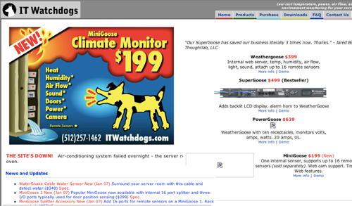
But you’re anticipating the punch-line — ITWatchDogs grew every month, made millions of dollars, stole business from competitors with billion-dollar market caps (and professional-looking websites), and had a successful exit.
Of course it’s only fair to also point out some of the many instructive counter-examples:
- Hipmunk is the same thing as Orbitz or Travelocity — the only difference is amazing design, not just because it looks good but because it’s so useable. In the words of Joel Spoksly — the design “affords usability.” (P.S. Early Hipmunk team member Alexis Ohanian is so cool and smart and rich and funny and successful and good-looking that really he doesn’t deserve to be alive. (P.P.S. Hey flamers, for God’s sake it’s a joke! Don’t you realize I’m just sore from losing the Pecha Kucha competition to him?))
- I always use and recommend Amy Hoy’s time zone tool only because it’s just nice to use and look at. (P.S. she also authors a terrific blog aimed at the solo entrepreneur.)
- Many people credit Mint’s smash success with their terrific design. Considering how many features were broken for how long, it’s hard to argue.
- 37signals documented — with data — how design changes results directly in more credit-card-swiping customers. It doesn’t get more “business value” than that.
So where does that leave us in the “matters / doesn’t matter” question of design?
I think you can go either way, but you must decide whether or not you’re going to value design as core to your startup’s identity, and then act consistently. Here’s what I mean.
It’s clear from the outset that design is the only competitive advantage Hipmunk has over its competition. Specifically, by making the flight-search problem pleasurable and useable instead of feeling like you’re navigating pivot tables from Excel ’98. They don’t have better data, better branding, better name, better SEO, or more money. Just better design, and not just easily-copyable incremental improvement, but a quantum leap better.
When design is that fundamental to the business — how it acquires and retains customers, garners attention and referrals, and distinguishes itself in the market — obviously design can be the most important thing.
Conversely, at ITWatchDogs the company’s internal and external culture was that we’re low-cost, friendly, approachable, regular guys, who understand exactly what you worry about, exactly what your budget is, and we nail it. The site might have looked bad, but our message couldn’t have been clearer.
In fact, all our competitors had these slick, corporate-looking sites, whereas the indifferent chaos of our website was not unlike our customers’ offices which themselves were littered with assorted hardware corpses and solder stains. (And I don’t buy the typical retort that “that’s design too,” because no designer on Earth would have put her name to that website in the name of looking “relatable.”)
Neither is it an absolute either-or whether design is important; WP Engine is a good example of this. We did fine before the redesign and we’re doing fine after it; I’m glad we did it, if not for objective data than for subjective feelings.
But it is useful to decide where you come down on the question of design in your startup, because if it’s important you’d better work on that right now and develop a consistent culture of valuing design through-and-through, and if it’s not important you’d better decide what is important and nail those things all the harder, because you’ll be competing with people who are using superior design to cover up their lack of competency in those same areas.
There’s so much more to discuss — let’s continue in the comments!
73 responses to “On the (un?)importance of design”
Congrats on the redesign. Maybe it was a huge step up from what it looked before, but I still don’t think it has achieved a professional and user-friendly enough look to achieve the profit margins you’re looking for.
You’re sort of acting like you have created this unbelievable design, but then saying design doesn’t matter because you haven’t seen an increase in sales. Well, from the looks of it, I can barely tell what services you offer right when I entered the home page. The headline and description does nothing for me and leaves me guessing – web hosting for wordpress? how is thsi different from regular website hosting?
Also, the colors you are using are very dull and antiquated. The tan is fine, but there is no other vibrant color on there. It doesnt look or feel friendly to me at all. It feels like you are selling cardboard packages or something.
The form you have for sign up is really long and unclear to me. The font contrast is also a little hard to read.
The benefits and features is basically a river of text on the screen with no images or anything that explains how you are different.
I still think you have a ways to go before you can say that design doesn’t matter because you have not really achieved a professional and user-friendly design yet. It’s getting there but it still has a ways to go.
All fair points, but realize that the designer who did this said the same thing about the old design.
Also if the new design is so bad — possibly worse from what you’re saying — then our numbers should have changed anyway, right? But there was no change.
Care to help us continue to improve the design? We do need the help…
100% agree.
I’ve found the headline/sub-headline (Unique Value Proposition) elements to drive a more measurable impact, especially during the earlier stages, than a face-lift. After settling on a particular “good-enough” layout/design, that’s all I experiment with. BTW, your t-shirt message connected with me immediately and might be worth testing :-)
To avoid putting out ugly or embarrassing design, one hack I’ve been using lately on my landing pages is to strip all design elements off the page and only focus on copy first. Then arrange the page with mostly text and introduce simple graphics to layout the page.
I concur with Eric Stevens that your design still needs work, good design isn’t just artistic and sleek, because something can be artistic and sleek yet unclear. Good art can be ambiguous but good design should never be. Good design is first and foremost about being accessibile. Can users quickly understand and use your product and service ? Is the aesthetics informative ? (Eric says your site aesthetics makes it feels like you’re “selling cardboard boxes”) Are you providing enough information or are you overwhelming users with too much information i.e.: “river of text”. Keep in mind there are different demographics that visit your site, a design that may work for some may not work for others. You want to optimize the design for those who need and will pay for your service. You have to understand who these potential customers are, what’s their pain point ? Once you understand your potential customers, and you have someone very knowledgeable in UX and design, you can then be able effectively use good design to appeal to them.
At http://www.microconf.com last week, Ramit Sethi, Hetin Shah, and Patrick McKenzie all did “web teardowns” of attendees’ websites. They were amazing. If you want to improve how your site makes you money, you should consider talking to one of them. Noah Kagan knows all of them well if you don’t.
Personally, I like your new site, but I’m no expert.
Ah, I’ve written a whole (unpublished) book trying to shoot down the “matters / doesn’t matter” dichotomy :) Good on you for sharing the data, I’m not sure eyeballing those graphs would be super accurate though — there’s a bit of variation there. And I don’t just mean that in a “maybe it’s subtly better way”, it could be subtly worse, 5-10% say, and hurting you.
Of course, the big question is whether you A/B tested the new design, not that A/B testing is a magic bullet, I just think the question should be more “which version of the new design” or “which of the design directions we were considering” performed best relative to the old design, not just ‘we took one shot and it converts about the same’.
Nevertheless, I think the fact that a new design can perform more or less as well as a busted old version (if it is indeed the case) is pretty profound. The objective weight of the data will, sooner or later, force web design to change to meet reality. It’s amazing how far we are from that reality right now.
On eyeballing the graphs: If you’re expecting a tangible change in user behavior, then yes you should see it on the graph. If it’s that subtle, then even if it’s “statistically significant,” it’s so small a change that it’s a surprise, and certainly a failure on the main goal, which is to tangibly “move the needle.”
It’s hard to “A/B” test a 100% redesign, though I agree with you on the principle. If there were a change in the numbers, you could easily argue that the change might have been due to a time-based change as well. But since the numbers didn’t move, it’s unlikely that we had both a big change due to the design (either direction!) coupled with a big change in the opposite direction due to something else.
Sure, but what’s going on with your conversion rate in that graph? Looks like it’s between ~0.5-1.1% — I take your word for it that it hasn’t changed overall, but that’s a big difference! :)
I agree it’s hard to 100% A/B test a total redesign (ditto issue on time-based changes), but my point was more that I’m sure the designer had 5 different variations on the new design, and a couple of different overall directions, so between design + message treatment, I’m sure you could come up with a couple of big or small riffs on the new design (did the message change?) and see how they compare. Maybe they’ll be moot too, but at the moment, who knows? You’ve got all the ingredients, seems a shame to not push it a little further with one/a few A/B tests and see what you can shake out.
Also, if this design change *is* more or less moot, why not pick to extreme ends of the design spectrum you’re considering and test those? Plenty of potential still there to see how much “design” really matters! :)
Can you clarify your terms a bit? When I read Joel’s article, the word that comes to mind is “usability” and when we talk about a visually slick, corporate website I think “design.”
If it really was the visual appearance of IT Watch Dogs that helped it counter-intuitively beat the competition, and not just better usability or content, then, man, someone _should_ put their name to that, and have a wall full of fancy degrees from high-priced universities, because it’s brilliant.
So I was saying “usability” specifically in the context of Hipmunk where, like Joel says, the design has “affordances” — making it clear where you can “grab” something and move it around, having instant visual feedback about what happens when you move it around, and that sort of thing. It’s easy to play and obvious how the controls work.
Which I’d argue is in stark contrast to how Travelocity works.
I’m not saying that always translates to marketing sites as opposed to web apps. That was just a good example of design being everything.
I’m also not saying that the ITW design “helped,” just that it didn’t seem to hurt.
Oh yeah, I didn’t think you were claiming the ITW design helped, just referring to your dismissal of other people claiming “that’s design too.” I mean… maybe it was? Maybe your customers trust the local hardware store more than they trust Wal-Mart? And prefer the website that looks like it comes from the average Joe? That’s what I meant would be clever, if it were in fact the case, and intentional.
This distinction is one that I find fascinating and I wish more people would share their findings on it. What’s important: Usability? Design? When, and why? Jakob Nielsen’s site is 100% usability, and I doubt any commercial venture would settle for something that unattractive. On the other hand, look at how plain del.icio.us (back in the day) was and its success. Does the difference lie in whether you’ve created an app, or an e-commerce site?
The problem is that design matters a lot, but what we commonly refer to as design is just style. You can have a well designed site that is ugly (bad style) but can be completely on message and really effective.
Then I think you’re calling “design” what I call “usability”, and “style” what I call “design” (and it’s why my first comment was asking for a clarification..)
Although there might be a difference between aesthetics and usability, I think we can all agree that improving both simultaneously is the best possible outcome. There’s no reason why Delicious/Craigslist/etc. could not be both usable and pretty.
And if you think that “pretty” doesn’t matter, then why do you think brands like Pepsi spend so much money to redesign their logo? If you ever want your brand to expand beyond early adopters, or just want to maximize your product’s potential reach, then sooner or later you’ll have to think about aesthetics and branding.
Well isn’t that the point of this article, whether or not pretty matters? From the numbers presented here, it’d seem that it doesn’t.
Yes, I was thinking something similar to this as I was reading the post. I’ve rarely seen visual design dramatically improve (or hurt) metrics, with a few exceptions where the visual design was a massive change in tone.
Usability or user experience redesigns, on the other hand, can make an enormous difference in metrics. Changing the way something actually works or the way a user interacts with something, like Hipmunk did, is a fundamentally different thing than making something more attractive, despite the fact that we call them both “design.”
Exactly right. Wasn’t it Don Norman who wrote in The Invisible Computer, “When technology delivers basic needs, user experience dominates”.
Well put, Laura.
Job Roles:
Changing the way something works or the way user interacts = interaction designer
Making something pretty = visual designer
Some interaction designers are good visual designers as well, but the vast majority focus on diagrams and flows (and leave the coloring in to the creatives).
Vice versa for visual designers, but they rarely consult interaction designers because “I can do it myself. I’m a web designer too after all!”
Wow. Awesome.
I have sent this to a half a dozen buddies – it actually answers an ongoing set of arguments by pointing out that we’re arguing over the wrong thing.
-XC
The design of a product sets the perception we have of it and how credible we think it is. Also, a better looking product gives you that extra push internally to go from conceptualization to execution as the Wufoo guys have pointed out earlier. I believe that good looks are a lot more than just the eye candy, so much so that I wrote an entire post on it – http://blog.fusioncharts.com/2011/02/good-looks-more-than-just-eye-candy/
Your new design made your graph look like the old, that is, it stabilized(!) your numbers. Otherwise it would go down and down and down due to inactivity over time ;P
I think this article is incorrect. Your new website is a fantastic design. Is it mayble less image-heavy than your last, sure? But a common theme in design is “less is more”. I don’t know that a design alone makes or breaks a product or a site. I think, for the most part, you have success on your own merits. Obviously that company with a terrible design has a great product that people want. Who is to say that they would not be making more money from a different segment of the market if they had a better design? A better question is: Why does their target audience not care about design?
It contributes to the overall feel of your company. If you’re selling business to business to people who know hardware, and just need what you have, does design really matter all that much? If you are selling to consumers directly, who want some more polish, don’t you think a case can be made for good design?
I think a good design can help you on the margins. It won’t win the battle but it can still effect your brand. I don’t feel there is much quantitatively behind this post, and even anecdotally I disagree with the premise.
“It’s clear from the outset that design is the only competitive advantage Hipmunk has over its competition.”
“Many people credit Mint’s smash success with their terrific design. Considering how many features were broken for how long, it’s hard to argue.”
I’d disagree with both of those statements. If Hipmunk’s design was TRULY the differentiator, you’d imagine that the folks who inspired their design ( http://www.quora.com/What-is-the-company-that-HipMunk-copied-design-wise ) would’ve been racing to the top with them, no?
Mint and Hipmunk are outstanding marketing companies. Great design is a (small) part of that. But they are/were both brilliant at PR, linkbait, A/B testing (I’m guessing here with Himpunk), social media, etc.
do you buy the package or the product? design thinking needs to be baked throughout the entire experience.
the package won’t sell the product all by itself.
Interesting post. But consider the audiences of the sites mentioned, especially the anomaly, Hipmunk. Even the name implies a design-conscious crowd. In targeting a niche of the market that maintains a certain value set, a certain lifestyle that happens to include design, had they’ve invested less in design, they would have missed the mark. Design was their differentiator.
Value hierarchies are inherent in every action. Most of your former customers did not come to decisions (conversions/sales) based on site design because, functionally speaking, they were not buying site design, and they apparently did not value it as a top priority. They were buying a product or service altogether divorced from a detrimental reliance on design sensibility. They had a need, the product exceeded the need. Who gives a shit about design? Historically speaking, what was the market share of a PC vs. a Mac/Mobile/Tablet during the life of those companies? Things change, and with change comes new value hierarchies. New expectations.
Designing to market (a kind of design formalism) is a cornerstone of product marketing communications. This is the case in just about every vertical of every industry. If you ever get a chance, point your car towards the HEB on Slaughter and Manchaca. Walk in buy a couple of items. Check out. Then, point your car towards the HEB on Escarpment, four miles West. Buy the same items and check out. Then talk to us about the importance of design and user experience selling the same stuff, to completely different audiences.
Based on the feedback you’ve received from those WPEngine customers hesitant to refer business because of the rat’s nest, after the changes, don’t be surprised if that audience spikes traffic and revenues. Monitor it accordingly. This might be all the evidence you need to create persona portals.
Jason, while your numbers are very interesting, I think they are not showing the complete picture of the effects that design has on purchase decisions. Can you publish conversion rates of visitors who come from search engines versus those who are referred by existing customers or reviews? I believe those can be a better indicator of whether the redesign helped people understand your service better and improve the trust in the company.
Great point! I’ll dig that up.
All else being equal, relationships matter. If your customers believe their success is important to you, they’ll forgive your warts, provided you continue to deliver the functionality they need.
I think the problem is that “Design” is an imprecise word. When we speak about whether design matters, we can be talking about many things that like improving aesthetics, usability, or even designing in a way that optimizes a page for conversion.
Designers who improve aesthetics and even usability have an impact that might not be so easily measurable. (that doesn’t mean it’s not important for some businesses).A great designer (who also has analytics skills) can test many combinations of simple (or complex) changes with color, layout, etc. that can have a major impact on conversion. Interpreting the results of the test is an analytics skills, but knowing what to change is an art, and some great designers excel in this area.
I think you’ve missed the boat with what it means to design. Consider something you’re more familiar with — code — for an example. What criteria do you use to determine whether or not a given piece of code is well designed? In the Ruby community we’re very cautious to let ugly, unclear code be deemed “okay”, so aesthetics are certainly part of it. Good looking, easy-to-read code still isn’t inherently well designed code, though. You’ve got to consider the context, objectives, and elegance.
Poorly Designed (and wholly contrived) Code (Ruby):
random == 1
guess = 3
if guess == 1 && random == 1
puts “You were right! It was 1!”
elsif guess == 2 && random == 2
puts “You were right! It was 2!”
elsif guess == 3 && random == 3
puts “You were right! It was 3!”
else
puts “You were wrong.”
end
Well Designed Code (Ruby):
random = 1
guess = 3
if guess == random
puts “You were right! It was #{random}!”
else
puts “You were wrong.”
end
Obviously the latter solution is much better than the former, and we see that. It’s more aesthetically pleasing, but it’s also better thought out. Design isn’t just about visuals — it’s about functionality and suitability for a purpose.
The WPEngine redesign *looks* better — nicer typefaces, a consistent theme, subtle textures — but it doesn’t get you closer to your objective of increasing conversion any better. In that regard, it needs work. I think Eric Stevens has it spot on regarding this: it isn’t clear what you do and why you’re better than the competition. Now it’s time to take that feedback and iterate on your design just like you would with your code. Do some new mockups that you *hypothesize* will address the problem and A/B test them. Iterate, iterate, iterate. It’s hard work, but that is how good design of all forms works.
If you need evidence of this in action, compare Yelp and Netflix, both of whom have similar looking websites (lot’s of red, fairly conventional controls, loose grid-based designs). While next to nobody appreciates Yelp’s design, Netflix is considered an industry leader in terms of their UI because they continually optimize based on real data.
As an ending note, experience is worth a lot more than good taste — a designer with good taste can spot a great looking website, but it takes one with experience to spot one that misses its mark despite looking great.
Great post! It totally depends on the competition. My company, Chart.io, is taking on the behemoths of business intelligence. Their products are awful looking. As a result, only a small group of users (mostly trained data analysts) willing to hold their nose are able to make sense of them. Generally, if you’re democratizing (i.e., disrupting an industry), great design is probably one of the core elements of doing that well. I think it applies especially to the trend of consumerized IT (which is basically, IT that isn’t unusable) where the principle of great design in consumer-land has made its way over to business-land.
I think UX design is important for sites that people need to interact with, like HipMunk. I’ve chosed SaaS solutions based on their site usability, so it has mattered to me.
For sites like WPEngine what you need to portray is competence. And frankly I found your prior design to be much easier to understand than your current design so I doubt that you can extrapolate your data and say that your new design is better, because frankly I don’t think it is. And this comes from someone who has been evaluating your service for potential use by clients.
Heh, Jason, I would say that the reason you guys have only seen a marginal impact to your redesign is because of that guy you got workin’ for ya, Aaron Brazell.
I mean that, the only reason we at Infamia.com recommend WP Engine is because we know him. More importantly, we know the work he and you guys are doing which is top notch, highly optimized hosting that’s not for your average personal blog.
That makes your website design, pretty irrelevant to us. In other words, the relative marginal impact of your redesign is actually a testament to the solid relationships you (by way of Aaron in regards to us at Infamia) established well before even getting the business off the ground. You’re offering a very specialized service that if say someone just looking to host their company website and they’re comparing you to what Bluehost or Media Temple has to offer and they were being swayed by the slick designs they have, then they really don’t understand the strengths of WP Engine and thus simply not a good client for you.
Let’s hope you don’t start getting a bunch of “noobes” now that you do have a nice design. :)
We recently wrote about how to pick the right hosting: http://www.infamia.com/choosing-a-website-hosting-service-a-5-point-guide.
Keep up the kickass work and the website does look a lot better!
All the best,Ernesto Gluecksmann
of course the site design would be irrelevant to you. you where not acquired as a customer by it. put your shoes in someone who lands at the home page of wpengine ( if you can) not as someone who became a customer because he or she knows a employee
The first thought that came to my mind was that the data is telling you to look more closely, not to necessarily abandon your initial hypothesis. Eric Ries describes a very similar story about when they redesigned the IMVU login.
The redesign probably didn’t matter because the product is overpriced. And considering the old database errors… why would I trust my site to a company that can’t even host their own site properly?!
This isn’t design, or at least not how I define design.
It’s a shame that you concluded that design isn’t important. What you really discovered is that, for your business, visual aesthetics may not be all that important. Those are two different things.
A visual refresh for the sake of a visual refresh (or artistry as you inferred) may or may not yield any tangible result. I took a look at the old WPEngine site in the Wayback Machine, and it didn’t look terribly hard to sign up, nor did was it difficult to understand your value prop. In fact, it was better than most, and so is your new site. Nor did it look that bad. My guess is it met your users expectation of aesthetic design just fine. And in the case of ITWatchDogs, great visual design may have even had a negative effect (“hey, you guys can’t be the cheapest – look how much you spent on web design!”)
Great design starts with clear goals in mind, or with the right question, and it’s aligned with the overall company direction. It sounds like you set out with no clear goal in mind, except to design something that looks better. Is it right to conclude that design doesn’t matter when it didn’t yield more conversions or increase time on site? In my mind, you achieved your goal – subjectively speaking the new site looks pretty decent.
If your goal had been to increase conversions, then that should have been the driving goal behind the redesign. You would measure where you are today, and set a goal for where you want to be after the redesign. You would do some testing with representative users (i.e. actual potential customers) to see where they might be getting tripped up in the purchase, or where you are losing them. Then you would do some quick prototyping to try some new design ideas to see if they convert better. You would tweak the design in quick iterations to settle on the design change that yielded the best result.
Don’t conclude that design doesn’t matter on this exercise alone. We’ve worked with companies in every corner of our space – online consumer, enterprise software, telecom, consumer electronics – you name it, and we’ve seen dozens get a competitive edge with a well conceived design strategy. The difference? Namely, they
– had a clear goal in mind (am I overdoing this point yet?)
– tested with, and got useful feedback from real users (http://bit.ly/iB2p5D)
– found the appropriate balance between aesthetics and usability (http://bit.ly/kUpnqY)
– measured the result
– worked with experts like us :)
As one of the people working on Hipmunk’s design, I’m glad to see it held up as an example of good design! And I think your article is spot on. Design (at least, in the purely visual sense) might not make a huge difference right away, but it certainly has an impact on your brand’s credibility and image. I really believe that in the long term, bad design will hurt you (just ask MySpace, and I think Craigslist will soon be gone for the same reason).
However, I must say that even though I love your new design I’m not sure if it’s really the most appropriate style for your site. Aesthetically it’s beautiful, with great typography, but I feel like it’s a little cold and unfriendly…
Looking at https://www.readability.com/ , they went for the same style, but added a green accent color which makes all the difference. So I would suggest adding a touch of color to your site, and then it’ll be perfect!
We struggled with the full-grayscale vs. touch-o-color thing. You’re probably right.
I think the call to action for the page does not stand out nearly enough. The “See plans and pricing” button just blends right in with the rest of the page. It looks like a mini header and needs to stand out much more.
Agreed. This can be where your touch-o-color thing can be done. It will really stand out with some color. And perhaps making it a big bigger. But a blue or green button color will draw much more attention to it and also make it feel less cold.
I definitely agree that making things pretty isnt always necessary, but I also agree with the general stress on the difference between UX and UI in the comments. Totally agree with Tony on mint being as good at marketing as design. As in all things startup, all this totally depends on your customers and space.
But while less important than core usability, I do believe in “brand” as an important long-term intangible in the relationship one has with a customer. Brand doesn’t have to mean slick or pretty – it all depends on how you want to position yourself. Craigslist implies no-frills, low-cost. Others go for tech cred, or quirky humor, or high-fashion, or modern design simplicity.
Glad you are calling all this into question, however.
Great insights, Jason.
I’ve just done a redesign of our product, and we just can’t seem to get people interested. How did you manage to get all these big guys interested in your product when you were the new kid on the block?
James
We still are the new kid. :-)
The answer is that I started with dozens of customer interviews until I knew there was a specific market: people willing to pay a certain amount of money for a certain product. So folks are pre-disposed to want it.
Of course there’s no general answer to your question — that’s one of the toughest parts of a startup. My first question would be: When you talk to someone who *should* be your perfect customer, and they’re still not interested, why not?
I’ve been wanting to interview as many people as possible, but there is the catch 22 of getting ‘You don’t have a product, why are you here then?’ and ‘You have a product, but I don’t want to talk with you about it’.
Any tips for getting past their defenses?
Good question. I’ll write a whole post on my way of doing customer interviews.
Short answer: You shouldn’t be pitching a product yet anyway. The goal is to understand their pain, their perspective, etc., not pitch a solution. If they don’t want to even talk to you about the problem, the problem might not be that big.
I suppose it depends on your long-term view of your startup. If you solve someone’s problem and have bad design, your customers won’t complain as long as the problem you solve for them is paramount to them. Might be enough for a startup. But wait, there is a time you won’t be a startup anymore, seriously. It’s a company then. Just a boring normal company. At that point your design gets your business card, your brand. And sooner or later the day comes when someone solves the problem you solved in first place, and they do it with grace and style. Do you think you can handle that sort of competition for long? My advice is not to think too much about being a startup but building something that lasts. Remember in school, getting one A grade a year is easy, getting A and B grades all high school time is what makes exceptional people stand out. When you startup, you implicitly make that sort if commitment. When you startup today successfully, you are a company tomorrow. You should be prepared for that.
I think the word “design” is not precise enough when talking about the performance of websites, it needs to be broken down into:
1) Usability
2) Brand “message”
3) Look and feel
4) Typography
E.g. you can have a nice looking site, but the usability, brand message and typography could all be wrong.
Plus you got to think about the actual content of the page, is it persuasive, plus is the product / service wanted, and priced right. A “pretty” site wont get someone to buy something they dont wont or think is too expensive.
On top of that you got to consider the competition, is it better or worst.
what a great topic! i had this same experience for a b2b enterprise software startup – first thing we did after our series A round was redesign the site and we had similar results – the new slick site made us and our investors proud, but our metrics didn’t change. what we learned was this:
1) separate design for a product and design for marketing. for a startup marketing site, copy trumps design. i like what Ash said in his comment. for me i want design to draw eyes to important copy and that’s pretty much it. (say what you want about ITWatchdogs – you had to have done some things right with the copy.)
2) a startup can A/B test and optimize design and copy all day long but it won’t matter if you are not working on a compelling “monetizable pain” problem to begin with. to point, the particular b2b startup never quite got over that hump, (and the result is they are being acquired for less than their investors put in……Which, by the way, is not fun.)
3) when you are working on a sufficiently compelling problem, however, then
i’ve found the best startup copy is quite often something to the effect of “do you have this problem?” (how clever….I know.)
4) for the product itself (ie hipmunk), design is huge. and the people who do it right are simply brilliant.
5) all that said, as the company grew and started swimming in bigger deals, it became clear that nice site design was essential for being taken seriously. no matter how compelling the product, every b2b startup hits a point where they face a credibility/reliability gap when attempting the big dream deal with that big dream customer. a crappy looking site digs a hole right from the start.
You didnt get better conversion because the signup form still sucks.
https://secure.wpengine.com/?plan_id=mst&coupon=
Hi Jason,
It
was a very nice idea! Just wanna say thank you for the information you have
shared. Just continue writing this kind of post. I will be your loyal reader.
Thanks again. Regards, http://www.iasr.in/
Looks matter when it comes to websites. It’s a simple fact. No one wants to view a site with offset colors and just a mess of things. You guys have a wonderful design here, I love it. :)
Great topic. One that surely starts a fire.
As a “designer,” I can’t help but feel that designers really designs for other designers. I think most forget that design really isn’t art and it shouldn’t be treated that way.
I think I had a very hard time distinguishing this in the beginning and now I feel that I am a better “designer” because I focus solely on function rather than aesthetics. Sometimes you forget that something looks pleasing because it is functional.
I read somewhere that “people look for contents despite design.” And I think this is as close as you can get to the truth. I think you made a right choice in redesigning the WP website because I think you will see the benefits in the future.
Jacek Utko, a newspaper designer made huge changes to his newspaper in europe and saw 30 – 100% increase in subscribers. Was it all design? Jacek says “no.” Did it help? tremendously.
At the end of the day, if design didn’t matter – the world would be a very boring place.