Early in my career, I was indoctrinated with the Cardinal Rule of User Interface:
A user interface should minimize surprise.
Have you always hated tabs inside dialog boxes? Understandable, but users know how they work, so you have to use them. If you put a scrollbar instead, half your users will never realize that scrolling is possible.
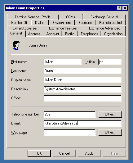
For example, this dialog is ridiculous but it’s still clear how to use it:

Is the default system drop-down list not exactly right for your purposes? Doesn’t matter; better to show an interface element that the user completely understands than one that fits the bill but needs deciphering.
This mantra curdles the blood of creative designers. It blocks innovation. The user might be unsurprised, but also will be unimpressed. Maybe even annoyed.
Using common metaphors also makes your product UI identical to all the others. There’s no personality, no brand, solidifying the notion that this product is “just another tool” rather than a new way of interacting with a computer. Surely technology can be better than that!
But this is an egocentric view. Your customers don’t want to figure out some newfangled thing just to navigate a dialog box. In fact, your customers don’t want to think about you at all. They have their actual job to do. They’d like to be able to do it predictably and safely. It’s not “fun” to solve the puzzle of your innovative new way of toggling a binary setting in a dialog box, or a drop-down that “scales to millions of items” except that there are only seven items.
How should you navigate this?
As technologists, we should strive to create better ways of working, interacting, and living. This mandates innovation in user interface design. The trouble comes when we change for the sake of ourselves instead of our customers. Changing a well-known interface because of some personal philosophy or pet peeve is not change for our customers’ sake, but rather to scratch some idiosyncratic, selfish itch.
The question to ask is: What will maximize your customers’ utility and joy?
When a standard user interface element will work, but you foist some fancy new thing on the common person, you are not increasing joy.
Conversely, consider the “opening screen” — the thing a customer sees when they launch the product for the first time. What is that new-user experience like? Could you craft something that accelerates the user becoming successful with the product? If so, that creates both joy and utility. Simply copying the “pick a template” screen from Microsoft and Apple Office products is unlikely to create joy.
One of the things Snapchat gets right is their use of novel user interface. The initial product launched into a mode that was immediately ready for video and then for sharing. Zero extra icons to click or things to type out. This created the perfect experience for their specific use-case — non-professional, non-edited, immediate, temporary image-based messages.
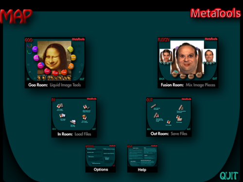
On the other hand, back in the heyday of pre-OS-X Macintosh, a product called Kai’s Power Goo famously failed even though it was an innovative and interesting photo editor because it was so confusing to use. Even simple things like a color-picker or a slider for image brightness was an adventure in deciphering an alien language. Their attitude was: If you’re cool, you’ll get used to it. But customers’ attitude was: This is annoying.
Unless you think it’s awesome to have to navigate to the “Out Room” and figure out which of the five meaningless icons to click on just to save a file, or figure out whether “crop” can be found in the “Goo Room: Liquid Image Tools” or in the “Fusion Room: Mix Image Process.”
What makes Snapchat joyful and Power Goo annoying? The former was different with a customer-driven purpose; the latter was different for different’s sake.
If you’re going to be different, do it because there’s a clear and powerful reason why this will make customers rejoice. If they smile when they first try the product, that’s a good sign. If their eyebrows collapse as their mouth pulls to the side, that’s a bad sign. When you hand your app to a friend for a hallway-usability test, watch their face as much as you watch them swipe.
If you’re going to be different, make it amazing. The goal isn’t to be “different,” it’s to be “better.” If you invent something slightly better, that’s not enough to overcome the penalty of someone having to learn something new. It has to be overwhelmingly better.
If you’re going to be different, select the subset of the product that really benefits from an invention. Anything that can be normal, should be. Save the surprise from those moments where learning a new motion pays off, and is even delightful to discover. Too much difference is overwhelming.
When your customer shows your product to another potential customer, you don’t want them to say “Check this out, it’s different.” You want them to say “Check this out, it’s awesome.”
Don’t be different. Be awesome.


8 responses to “Should you invent a new UX?”
Excellent advice that is scarcely followed. It’s not even new advice – Steve Krug and Vincent Flanders have been documenting what happens when companies choose opaque/annoying vs. transparent/easy to use since the beginning of the web.
I find myself often pointing people to Flanders’ definition of Mystery Meat Navigation, because even in 2017 there are those who are determined to use hieroglyphs instead of plain text to link to the Case Studies page.
That said, while consumer-facing software gets a lot of UX attention, back-end tools and enterprise software is often neglected. Just bringing those up to modern-day standards, even using off-the-shelf frameworks without inventing anything new, often brings huge advances in usability and customer satisfaction. It’s not cutting-edge, but there’s a lot of opportunity to make lasting improvements.
> If you’re going to be different, select the subset of the product that really benefits from an invention.
This. You need to know where your product differentiates itself. Returning to the Power Goo example, they weren’t offering a product with a new way to save files. They were offering a new way to manipulate images. But they changed the Save File functionality anyway, even though nobody wanted it, and it had nothing to do with the product’s goals.
Are you a designer or a solutionizer? If you are a Designer then you design for the problem at hand and don’t look towards rules. You use methods like Goal Directed Design to provide insights.
Circular, flawed logic.
A designer is always required to solve problems within constraints. Sometimes those constraints involve pre-existing forms.
Otherwise every web design would require rethinking browsers, or even the OS. Zzz.
You solutionizers can’t see it
As a designer, I would want to evaluate the existing forms (or constraints) as well while designing to achieve the intended goal. Especially when the goal is user-oriented, I would want to take into account the biases of the users to certain pre-existing forms. These biases may be a result of frequently using the form that creates a muscle memory for that particular kind of action. Replacing this form may introduce friction in the flow for the user. It might not be worth it for the user if the new form isn’t significantly better than the previous one. It’s a subtle trade-off that the designers need to be aware of.
I think your eyeballs are tinted. Kai’s Power Goo failed?
First off I knew it as Kai’s Power Tools Goo, which was available as a standalone or a photoshop plugin via KPT with the simplified interface you apparently yearn for.
Nothing else could do what it did. It was a weird software that got away with it’s dopey interface because the audience wanted to screw around with it… incentivized by the end result. It had default tools that you could *not* easily replicate in photoshop, and it intentionally extended it’s brand quirkiness to the interface.
I’d say it broke the rule that “for kids = bad and dumb” but its primary goal was to be distinct, which it clearly accomplished. I’m not seeing too many articles on the elegance of corel draw’s bezier dialog or aldus pagemaker’s futuristic hanging quote tool.
I don’t think anyone professionally editing graphics actually gave a shit about the standalone version.
https://www.google.com/amp/www.macworld.com/article/3005783/software-graphics/an-ode-to-kais-power-goo.amp.html
Hi A Smart Bear Team,
My name is Anuj Agarwal. I’m Founder of Feedspot.
I would like to personally congratulate you as your blog A Smart Bear has been selected by our panelist as one of the Top 75 SAAS Blogs on the web.
http://blog.feedspot.com/saas_blogs/
I personally give you a high-five and want to thank you for your contribution to this world. This is the most comprehensive list of Top 75 SAAS Blogs on the internet and I’m honored to have you as part of this!
Also, you have the honor of displaying the badge on your blog.
Best,
Anuj
Thank you. your website is very impressive. you share very informative posts. keep it up. Microsoft Office 2017 Crack