
Early in my career, I was indoctrinated with the Cardinal Rule of User Interface:
A user interface should minimize surprise.
Have you always hated tabs inside dialog boxes? Understandable, but users know how they work, so you have to use them. If you put a scrollbar instead, half your users will never realize that scrolling is possible.
For example, this dialog is ridiculous but it’s still clear how to use it:
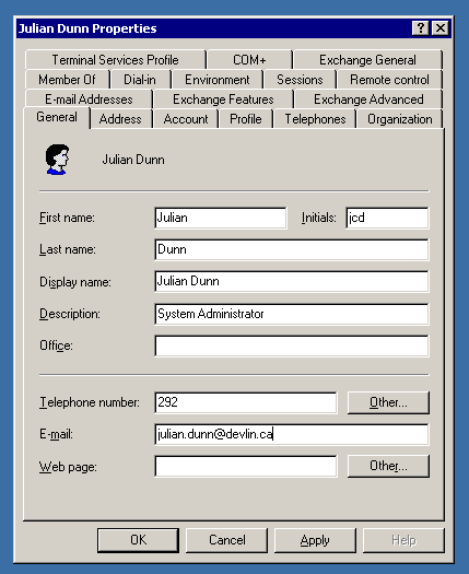
Is the default system drop-down list not exactly right for your purposes? Doesn’t matter; better to show an interface element that the user completely understands than one that fits the bill but needs deciphering.
This mantra curdles the blood of creative designers. It blocks innovation. The user might be unsurprised, but also will be unimpressed. Maybe even annoyed.
Using common metaphors also makes your product UI identical to all the others. There’s no personality, no brand, solidifying the notion that this product is “just another tool” rather than a new way of interacting with a computer. Surely technology can be better than that!
But this is an egocentric view. Your customers don’t want to figure out some newfangled thing just to navigate a dialog box. In fact, your customers don’t want to think about you at all. They have their actual job to do. They’d like to be able to do it predictably and safely. It’s not “fun” to solve the puzzle of your innovative new way of toggling a binary setting in a dialog box, or a drop-down that “scales to millions of items” except that there are only seven items.
How should you navigate this?
As technologists, we should strive to create better ways of working, interacting, and living. This mandates innovation in user interface design. The trouble comes when we change for the sake of ourselves instead of our customers. Changing a well-known interface because of some personal philosophy or pet peeve is not change for our customers’ sake, but rather to scratch some idiosyncratic, selfish itch.
The question to ask is: What will maximize your customers’ utility and joy?
When a standard user interface element will work, but you foist some fancy new thing on the common person, you are not increasing joy.
Conversely, consider the “opening screen” — the thing a customer sees when they launch the product for the first time. What is that new-user experience like? Could you craft something that accelerates the user becoming successful with the product? If so, that creates both joy and utility. Simply copying the “pick a template” screen from Microsoft and Apple Office products is unlikely to create joy.
One of the things Snapchat gets right is their use of novel user interface. The initial product launched into a mode that was immediately ready for video and then for sharing. Zero extra icons to click or things to type out. This created the perfect experience for their specific use-case — non-professional, non-edited, immediate, temporary image-based messages.
On the other hand, back in the heyday of pre-OS-X Macintosh, a product called Kai’s Power Goo famously failed even though it was an innovative and interesting photo editor because it was so confusing to use. Even simple things like a color-picker or a slider for image brightness was an adventure in deciphering an alien language. Their attitude was: If you’re cool, you’ll get used to it. But customers’ attitude was: This is annoying.
Unless you think it’s awesome to have to navigate to the “Out Room” and figure out which of the five meaningless icons to click on just to save a file, or figure out whether “crop” can be found in the “Goo Room: Liquid Image Tools” or in the “Fusion Room: Mix Image Process.”
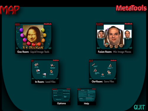
What makes Snapchat joyful and Power Goo annoying? The former was different with a customer-driven purpose; the latter was different for different’s sake.
If you’re going to be different, do it because there’s a clear and powerful reason why this will make customers rejoice. If they smile when they first try the product, that’s a good sign. If their eyebrows collapse as their mouth pulls to the side, that’s a bad sign. When you hand your app to a friend for a hallway-usability test, watch their face as much as you watch them swipe.
If you’re going to be different, make it amazing. The goal isn’t to be “different,” it’s to be “better.” If you invent something slightly better, that’s not enough to overcome the penalty of someone having to learn something new. It has to be overwhelmingly better.
If you’re going to be different, select the subset of the product that really benefits from an invention. Anything that can be normal, should be. Save the surprise from those moments where learning a new motion pays off, and is even delightful to discover. Too much difference is overwhelming.
When your customer shows your product to another potential customer, you don’t want them to say “Check this out, it’s different.” You want them to say “Check this out, it’s awesome.”
Don’t be different. Be awesome.